![]() Here is a perspective of the latest global temperature.
Here is a perspective of the latest global temperature.
Global temperature has been accurately measured by satellites since 1979 and this graph from the US Government CDIAC shows the cumulative carbon dioxide emissions during that period (after the red line)
 http://cdiac.ornl.gov/trends/emis/graphics/cumulative_global_1751_2007.jpg
This is a rare graph of the actual global temperature during that period. It is rare because the global temperature is seen as a virtually flat, straight line when plotted from zero.
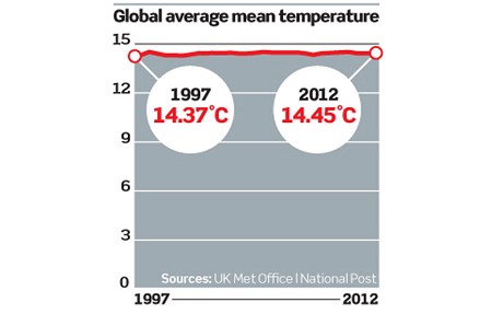 http://www.telegraph.co.uk/earth/environment/globalwarming/9919121/Look-at-the-graph-to-see-the-evidence-of-global-warming.html
That virtually flat line can be plotted as a “temperature anomaly” graph which exaggerates the tiny variations (less than half a degree) in global temperature so we can see how much they vary from the average.
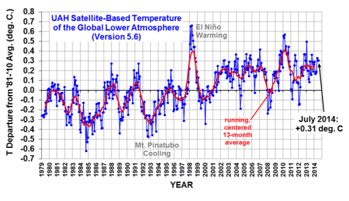 http://wattsupwiththat.com/2014/08/05/uah-july-global-temperature-essentially-unchanged-from-june/#more-114131
The blue graph above is NOT a measure of global temperature – it is a measure of how it varies. The trend before and since a spike in 1998 is essentially flat. The global temperature is remarkably stable and self regulating.
Despite an almost exponential rise in human carbon dioxide burning we see only trivial rises in global temperature during the above satellite record and virtually no change for over ten years now. Waiting, waiting, waiting….

Leave a comment